This year’s Printers Row Lit Fest was an opportunity to talk with several self publishing entrepreneurs or authors/artists. Bravo to all who have made this journey!
We bought books from two indie/self publishers at the Lit Fest; both books are image intensive. One photographic the other illustrative. However, one noticeable difference was the placement of (single) page images.
The book designer of the illustrative book failed to recognize that the artist’s illustrations should have been on right-facing page.
The right-facing page in ANY [printed] book or publication is the most valuable space. Our eye is naturally drawn to the right-facing page. Turn the page of a book or magazine, the physical action of turning the page reveals the right-facing page first. (Except for some cultures who’s written orientation may be different.)
Using the right-facing page to your advantage
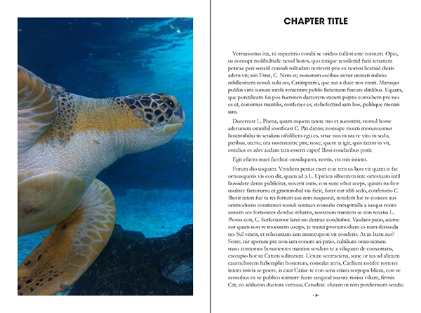 |
| Exhibit A: Image on left. |
The illustrated book failed to create a proper title page for each section; placing the illustrations on left-facing page with no designated chapter page. The artist’s illustrations the showcase of the book.
In contrast to the coffee-table book which created a spread. Using both left and right pages to designate a new chapter.
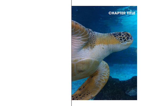 |
| Exhibit B: Shift the image to the right. |
The noted difference between these two book designers is a designer who clearly understands foundational strategies to creating a reader-centric experience.
 |
| Exhibit C: Ideal page spread introducing a chapter or section |